

Arrows in Theories of Change, Logical Frameworks and Logic Models are supposed to show causal influences. But often they are (mis-)used to show definitional connections as well, e.g. when one variable summarises others. This article explores the problem and suggests a solution.
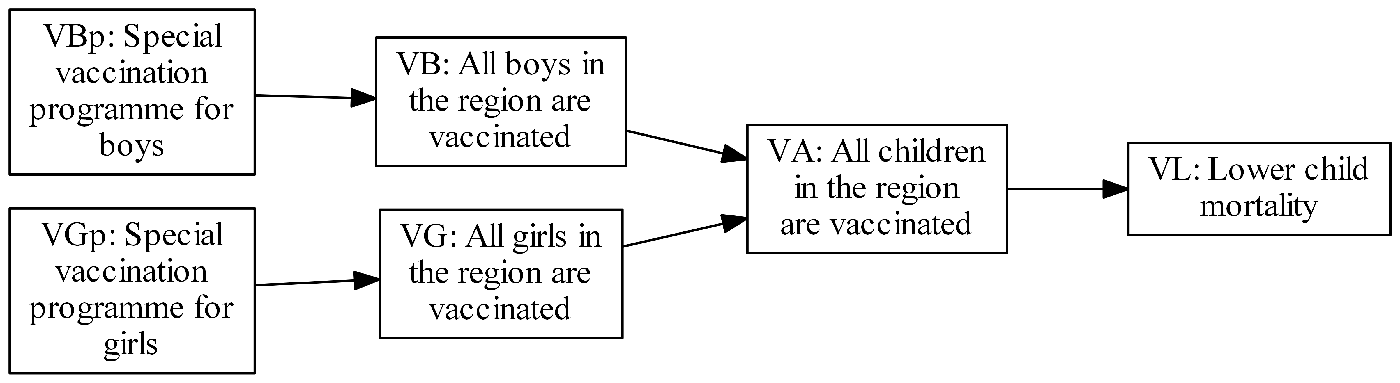
The arrows in this kind of diagram are supposed to be causal but the two arrows in the middle of this diagram are not
Logical Frameworks, Logic Models and Theories of Change (here, we’ll call them all “Theories of Change” although there are important differences) very frequently contain the kind of problem shown in this figure. According to standard manuals the arrows joining up the items are supposed to show causal influence, like the two arrows on the left and right of the toy example above. But the two arrows in the middle are not causal: VA is not caused by VB or VG.
(We’ll assume that these rectangles all represent binary, true/false variables, e.g. vaccinated or not, rather than the number or percentage who are vaccinated – though the problem is essentially the same whether they are binary, numerical or anything else.)
These two arrows show a relation of definition: the value of VA is determined by definition, not causation, to depend on the values of VB and VG.
Most manuals forbid this as nonsense because links like these are not in fact causal. The reason we nevertheless often see this kind of configuration is because it is useful nonsense. For example the project is paid for VA, not for VB or VG. A variable like VA can summarise multiple small achievements into something which is significant when we take “a higher-level perspective”, for example that of a donor. Or perhaps we only have evidence about gender-specific vaccinations on the one hand (VBp to VB, VGp to VG) and about the effect of VA on VL on the other, so we are not quite justified in drawing arrows directly from VBp and VGp directly to VL[1].
Here is an improved version.
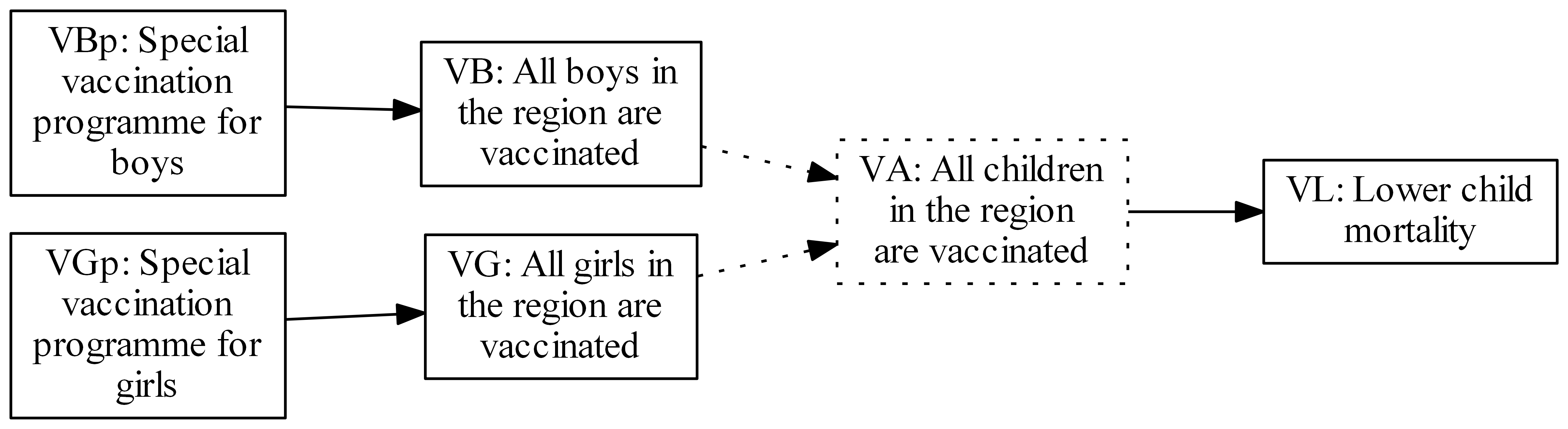
An improved version
If we agree a convention that dotted lines show definitional links, this new version is no longer nonsense, because those links are no longer to be interpreted as causal. It also shows that being on the receiving end of definitional links does not make a variable unreal or virtual; VA really does cause lower mortality. The defined/caused distinction is not about variables but about the relationships between them.
If there’s space in the diagram, the narrative inside the rectangle could say:
VA: All children in the region are vaccinated; Defined as VB & VG[2]; Indicator: Not Applicable
In the diagram above we also introduce an additional convention: a dotted border around a variable shows that it does not have its own data. If you want to know about VA, given that you know how it is defined in terms of VA and VB, you just look at the data for them instead, and combine them. Either VB and VG have their own data, or VA does, but not both. That is why, if you have “indicators” for VG and VB, it is nonsense to ask for indicators for VA. Insisting that every item in a logical framework has its own indicators leads to nonsense in the case that it includes variables which are defined in terms of, rather than caused by, others.
The same principles can and should be followed not just in graphical but also in narrative Theories of Change, which should spell out that VA is “defined as VB & VG” and that no separate indicator should be specified.
It is also possible that VA is the variable we are going to measure, in which case it is VG and VB which don’t carry their own data and get dotted borders, like this:
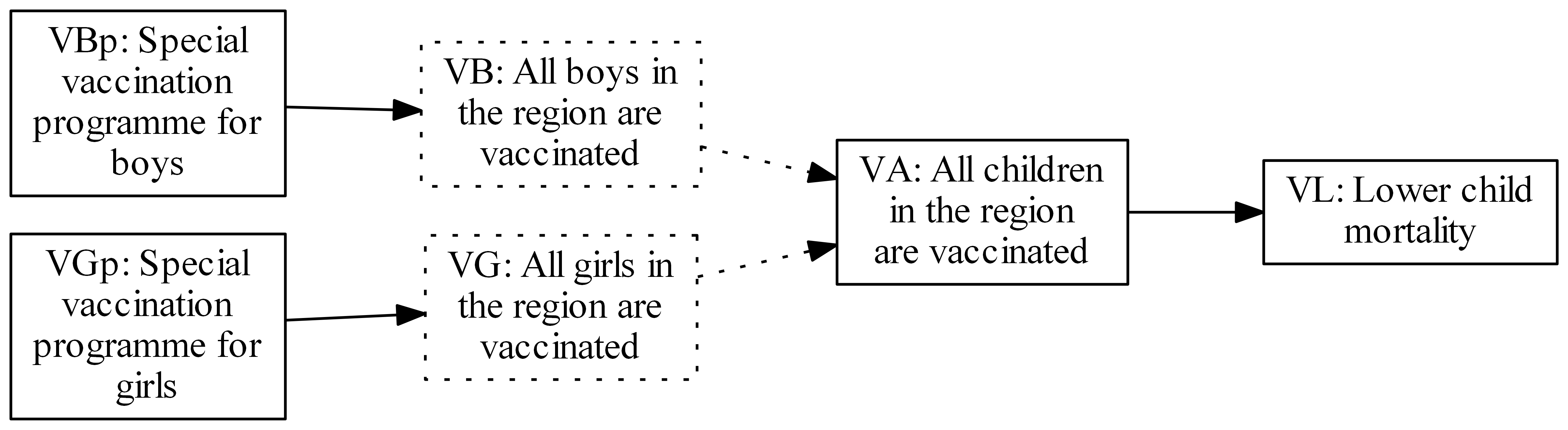
Alternative improved version, in which VA, not VB or VG, contains data
Finally, another example. Suppose a project’s activities lead to an increase in children’s musical creativity. The project is funded as part of a programme which aims to increase children’s creativity in general. Musical creativity is presumed to be a part of general creativity; perhaps the latter is defined as the average of creativity in several different domains, one of which is music. The project management is keen to show how the project’s immediate benefit (musical creativity) is a benefit for the donor’s broader focus too, like this:
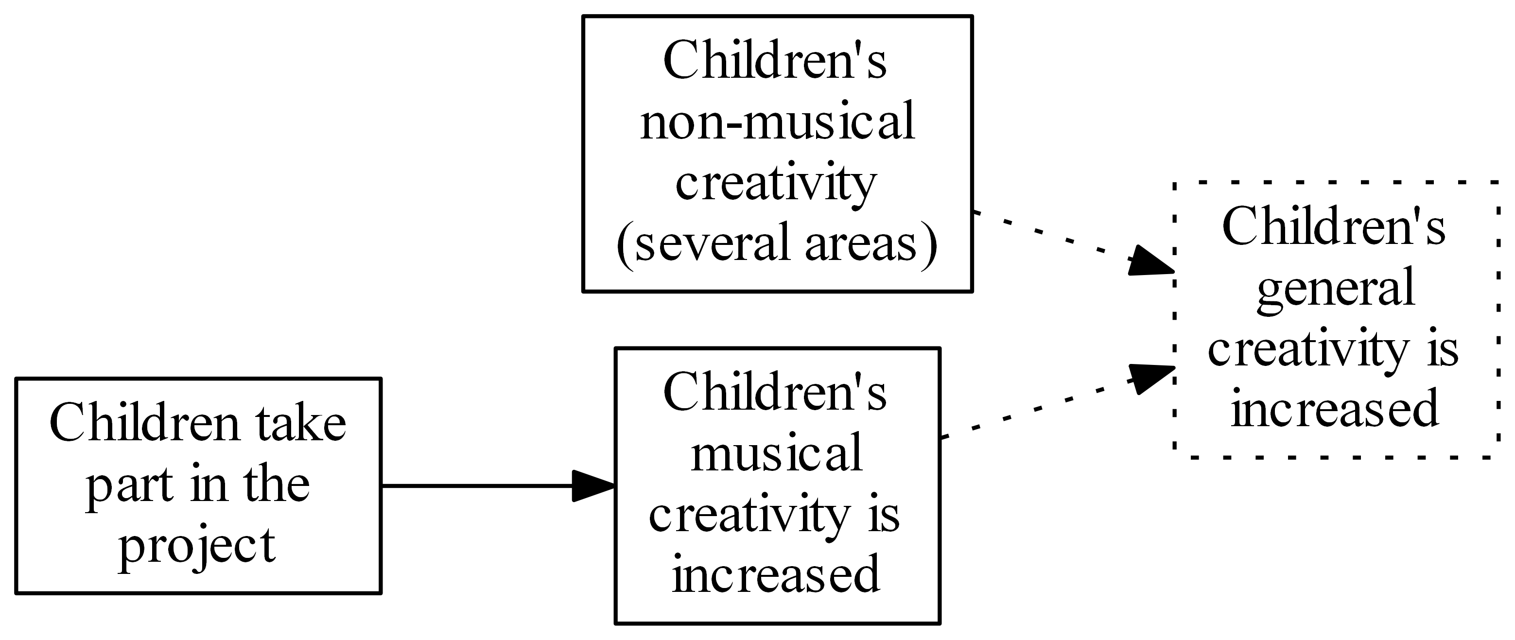
Contributing to a higher-level defined variable
General creativity is shown as (partially) defined in terms of musical creativity, so a dotted arrow is shown. It has been necessary to show the other factor(s) too in order to complete the definition. Showing only the contribution of musical creativity to (the definition of) general creativity would not be satisfactory.
Very frequently, this kind of project also tries to influence the rest of the “higher-level” outcome too, which would seem to result in a link which is both causal and definitional at the same time: not a good idea. Instead, we can show a link from musical creativity to the other part(s) of the definition, like this:
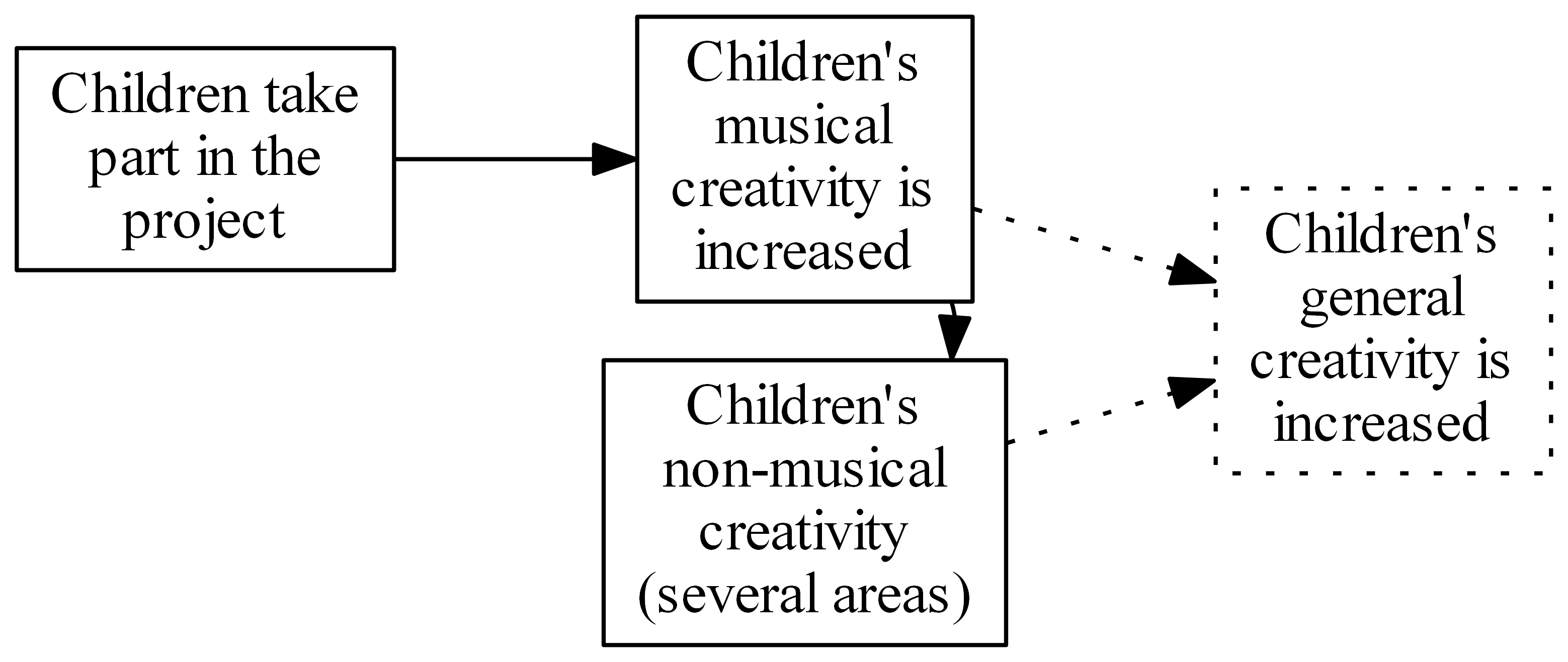
Contributing to a higher-level defined variable and causing it too?
These conventions – using dotted lines to show definitional links, and dotted borders to show variables without data, can be used on their own and are also part of the Theorymaker language[3] for visualising Theories of Change.
[1] i.e. the logical “&” which is true if an only if VB and VG are true
2] for example, because there might be interaction effects between VBp and VGp
[3] Theorymaker has other ways to solve the problem outlined here, see pogol.net/public/slides.html#/defined